Wet n Wild introduced new 5-pan Color Icon palettes for Spring 2014, and I’m sure you’ve already seen some or all of these at your local drugstores. I’m trying to experiment more with makeup this year, so instead of going for my usual neutral earthy tones, I picked up Art in the Streets palette, featuring five bright matte eye shadow colors.
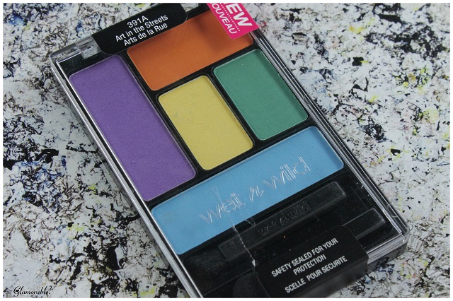
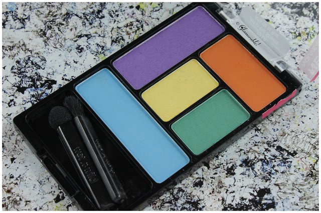
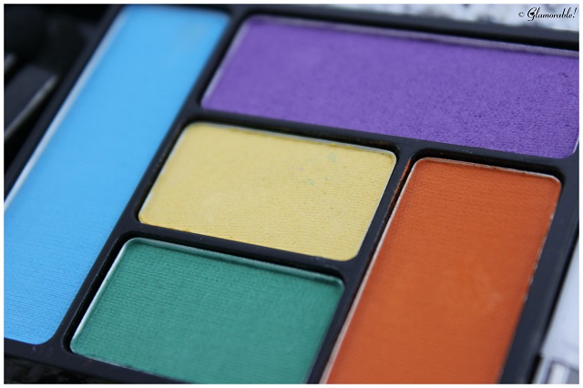
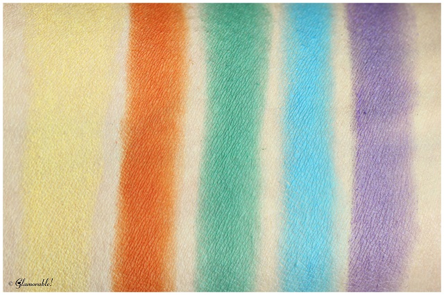
Art in the Streets palette features five bright matte colors: lilac, tangerine, lemon yellow, cool green, and sky blue. The quality of the eye shadows was pretty inconsistent across the palette, and some shades offered better pigmentation and staying power than others. The worst one would be yellow, with it’s low pigmentation, chalky feel, moderate fallout and poor blendability. The best one is tangerine: highly pigmented, saturated color that blends well, has good staying power, and doesn’t produce much fallout. Lilac, green and blue fall somewhere in the middle, and are relatively close to one another in terms of overall quality.
All five colors are fairly powdery, and I made a mess in my palette while I was swatching. The arm swatches in this post were swiped 4-5 times over dry clean skin [no primer, no foundation] using the included applicators.
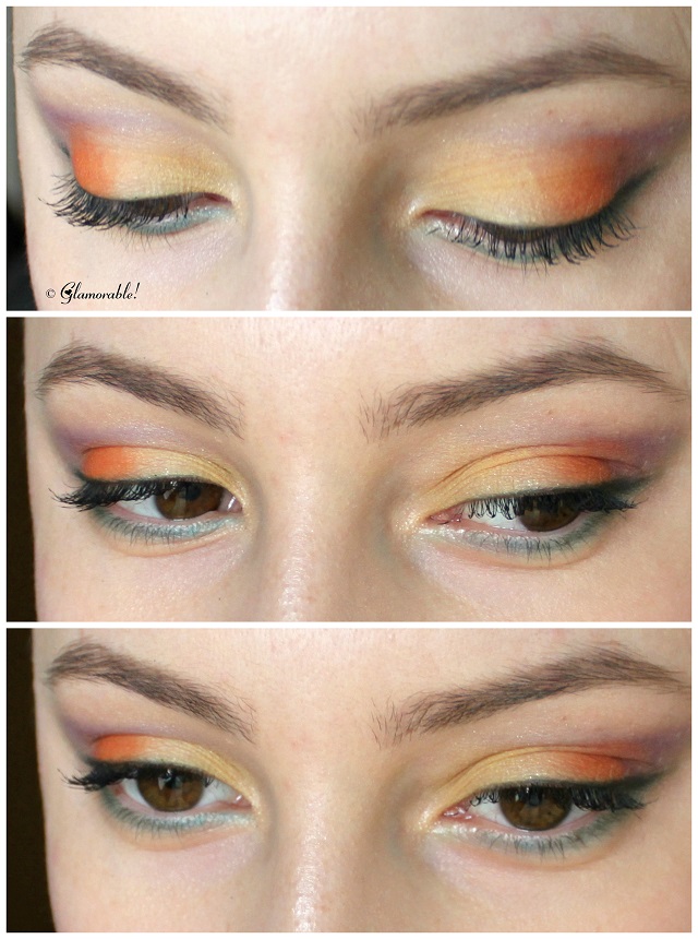 For the eye look above I only used the colors in the palette and nothing else [which explains why I didn’t put some shimmer in the inner corner of my eye, or along the waterline]. I’m literally using all of the colors at once, and I think they actually work together alright. I applied yellow color in the inner half of my top lids, and orange in the outer half, then gently blended the connecting line to make the transition look seamless. For my crease color I chose the lilac shade, and since it’s not super pigmented, it worked really well to give this already crazy combo a soft diffused look [imagine if it wasn’t sheer, I would look like a clown!]. Bottom lid is lined with blue color, and then with green on top of it. To create the dark eyeliner effect on my top lid, I used a dampened angled brush and mixed the blue, purple and green colors together, to get this dark dirty green which worked great for a soft cat eye liner effect.
Other products I used: benefit Gimme Brow in Medium/Deep, Missha Perfect Cover BB Cream in #21, Hourglass Film Noir Mascara in Onyx.
THE VERDICT
This palette has some winners and some losers, but we gotta give it to Wet n Wild for adding matte eye shadows to the lineup, because it’s really hard to find them among drugstore brands at that price point. While the formula is a bit powdery, and some shades are less pigmented than others; overall all five colors can perform well over primer or foundation. Tangerine is an absolute gem – pigmented, non-chalky and long-lasting, – and if you love that color, you might want to pick up this palette just for that pan alone.
PRODUCT RATING
83%, B
Formula 8/10 | Application 8.5/10 | Pigmentation 8/10 | Longevity 9/10 | Product 8/10
PRICE & AVAILABILITY
$3.99 USD for 0.21 oz. Available at Drugstore.com, local drugstores.
Ingredients:
Talc, Nylon-12, Boron Nitride, Ethyl Macadamiate, Magnesium Stearate, Dimethicone, Caprylic/Capric Triglyceride, Polybutene, Caprylyl Glycol, Calcium Sodium Borosilicate, Caprylhydroxamic Acid, Glycerin, Macadamia Integrifolia Seed Oil, Tocopherol, Methicone, Dimethicone/Methionine Copolymer, [+/- (May Contain): Carmine/Cl 75470, Ferric Ferrocyanide/Cl 77510, Iron Oxides/Cl 77491, Cl 77499, Manganese Violet/Cl 77742, Mica, Red 40 Lake/Cl 16035, Titanium Dioxide/Cl 77891, Ultramarines/Cl 77007].

Hmm. Your look is nice! But I’m disappointed in the quality. I have this one but haven’t opened it yet. Sounds like a good palette for depotting and keeping the good ones like the orange!
Hi Judy! — Thank you, I’m glad you like the look, but it’s just as you said, the quality is lacking overall, except for orange.
your swatches of this look amazing!!
Hi Brooke! — Glad you like the swatches, I was hoping they’d come out well.
I love the look you created, though the pigmentation does seem weak.
Hi Leticia! — Thank you, I’m happy that you are enjoying the look. The pigmentation is weak, indeed, except for the orange pan.
Fun and vibrant. The pigment on these is seriously lacking but I do like that it makes this particular quint more wearable
Hi Laura! — Totally agree with you, I really wish the colors were more pigmented.
I love the look and the bright shades. What a bummer that the pigment is not sooo great like other Wet-n-Wild palettes. But sounds like a good overall palette for the price. Great post
Hi Jamie! — Thank you, I’m glad you like the look! I feel like Wet n Wild are on the right track in terms of color coordination, because all 5-pan palettes contain some seriously gorgeous shades. However, I feel like the quality has gone downhill, I hope they pick up the slack and bring back the formula we all love.
I got this palette to review… and it arrived shattered! I’m dying to try it and will probably just pick another one up!
Bummer! I look forward to hearing what you think about it, maybe your experience will be different.
Love the shades in this palette and the look you created!
Hi leelo! — Thank you, I’m happy that you like the look! 🙂
I love your eyelook!!
Hi Destany!! — Thank you, I’m happy that you like the look 🙂
I haven’t seen these here long enough to pick them up and give them a try yet. I love the eye look you created. 😉 I hate when things can be a little hit and a little miss… but in drugstore – sometimes it’s worth the buy I guess. 😉
Hi Honey! — I’m so glad that you like my eye look, using bright colors is still very new to me 🙂 And you’re right, that’s often the case with drugstore products.
I really like the “sunset” eyes look you created! What the heck is up with WnW’s new palettes though?! They are 50-50 it seems, in terms of payoff.
Hi Amber! — You got it! This look was inspired by a sunset, indeed 🙂 I know, right, the quality of the formula is so inconsistent, I wonder what’s going on with WnW lately. At least they’re on the right track in terms of colors, because all of the 5-pan palettes are well-coordinated.
For $4, this is a good deal and I like some of the colors (and your eyes look so pretty!).
Hi Norah!! — For $4 it was worth it just for the orange color alone, because it’s actually really good in terms of quality. And thank you :)) <3
The colors look so vibrant in your swatches! I want to try this palette!
Hi Eugenia! — They do look vibrant, but it took 4-5 swipes of each color to make them show up like this, so keep that in mind! 🙂
I like your look!
Hi Phyrra!! — Thank you, I’m glad you like the look 🙂
That is a pretty eye look. 🙂
I am disenchanted with Wet-n-Wild’s ColorIcon shadows, lately. They just aren’t the quality they used to be. I bought a recent palette and the quality was so disappointing that I am most likely going to pass on them from now on. 🙁
Hi Erika!! — I know how you feel, I also expected more from these palettes, but the quality just wasn’t there. I will most likely pass on their future releases, as well.
I saw these recently and I was curious how they compare to the older Color Icon palettes. I might pass on these newer ones no.
This looks so fun and exotic! Bummer they’re powdery!
These colors are vibrant and the looks you created with them are gorgeous!
I love the vibrant colors! Especially the green liner.
Well… at 4/5 swipes they look pretty good LOL! I heard the Poster Child 8 pan was better with very similar colors.
I love the vibrant colours and the look you created. The colours kind of remind me of crayons, hehe.
I haven’t seen this one, but I picked up the Urban Decay Electric palette, so I have some matte brights to play with! I like the yellow/orange on your lids, very sunset!
The color quality is beautiful!
The swatches look great and so does your EOTD!
http://www.naomiganzudivamode.com/
Can we follow each other? 🙂
Wow, those are some bright shades!
I like how you used the colors. In fairness, your photos and application made Wet n Wild so-so palette look high-end!
The color combo of the palette is super fun and reminds me of the UD electric palette ! I’m loving the eye look you created.
I wasn’t really happy with the 5-pan I picked up, but might have to give this one a try!
I love the look you created soft yet bold! It makes this palette more wearable for day also. Most tutorials l ve seen for this are way bright and kind of “night” looks. I have this and I hope my look comes out as good as yours
Thank you Deanna, I’m so happy to hear that you enjoyed my look! I’m not a brights girl at all, and prefer softer colors myself, so I sheer them out when I can. I’m sure your makeup will be gorgeous!