Urban Decay Distortion Palette Review & Swatches
I know a lot of you were waiting for this release, so today I want to share my quick Urban Decay Distortion Palette review, swatches, and first impressions. What makes this palette different from the rest of UD palettes [and there are a lot to choose from!], is the top row of five shifty shades, designed to give your eyeshadow some extra oomph by adding a multidimensional ‘shift’. Each one of these five gorgeous colors essentially turns an ordinary color into a duotone, or a multitone depending on what you layer them with. I will demonstrate the shift in an upcoming post featuring my Urban Decay Distortion Palette makeup look, so for now here are my thoughts on the overall performance of each pan, paired with swatches.
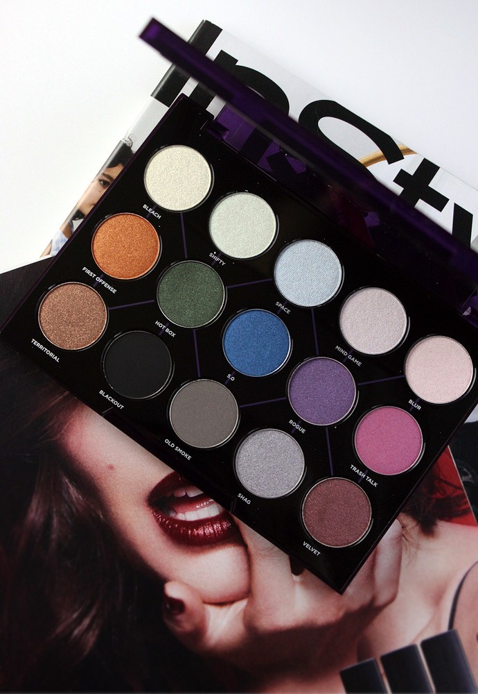
A little heads up on the colors you see in stock photos – they are not accurate [but you probably expected that]. Urban Decay Distortion Palette ($48) is darker and more muted than what you see online. For instance, that hot pink ‘Trash Talk is actually mauve in real life. So try to desaturate it a little bit in your mind, and you’ll get the real picture.
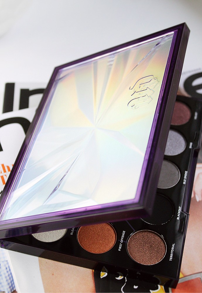
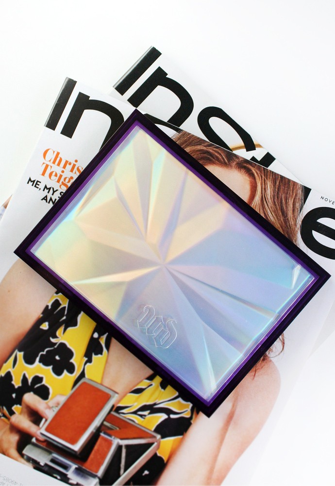
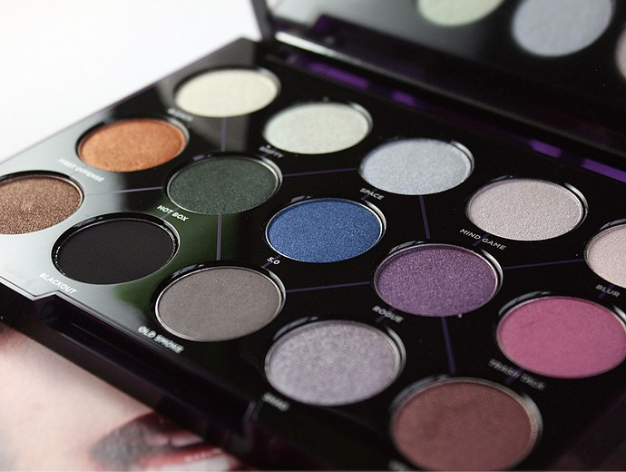
First of all – the packaging. This is a hefty plastic palette with a magnetic clasp, similar to UDxGwen collab. I gave that one away so I don’t have it anymore to compare, but I’m pretty sure they have the same ‘bones’. What I like about this case is that it’s equipped with a large fully functional mirror and a lid that doesn’t fall down or need to be held. You never really think about these simple things, but trust me, having a lid that you don’t need to hold with your finger to help it stay upright is really nice.
Urban Decay Distortion Palette
There are 15 pans in the palette. Top row consists of shifty shimmers, with the rest of the colors scattered around. If you are a makeup beginner or someone like me who doesn’t experiment much with colors outside of the beige spectrum, UD included a cheat sheet of sorts that is printed right inside the palette. You might have noticed that the pans are connected with diagonal and vertical purple lines. These lines signify that the two connected shades will work well together. So neat! Also, every vertical and diagonal row of three, starting with the ‘shifter’ from the top, is also a combo. But of course, you can play with these colors however you like, the lines are just a suggestion.
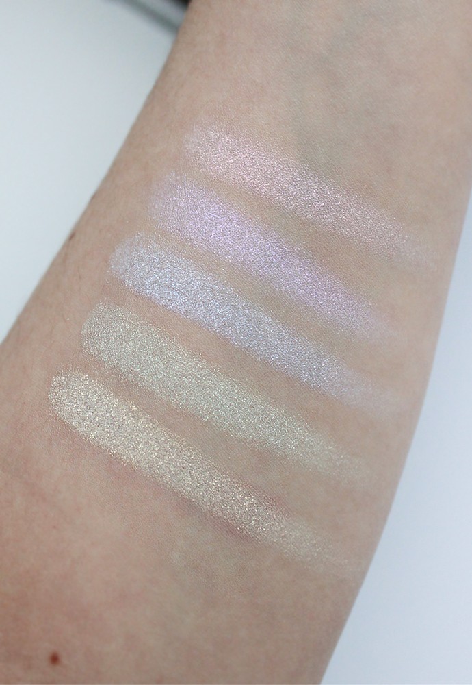
Urban Decay Distortion Palette Swatches (left to right): Bleach, Shifty, Space, Mind Game, Blur
Below are my own descriptions of the shades, and they may differ from those on other websites. Also, all swatches are done in daylight instead of studio lights, so you can see what they will look like in real life [or pretty close to it, since all screens show color differently].
TOP ROW:
- Bleach – pastel yellow with strong golden shimmer (warm). Richly pigmented, smooth, with great color payoff. Probably the best one in the top row, formula-wise.
- Shifty – pastel pistachio with strong green and golden shimmer (warm). A bit sheerer than Bleach, but still quite pigmented. It was also slightly dry and a little chalky, but nothing a good base can’t fix.
- Space – pastel lavender with strong sky blue and silver shimmer (cool). Sheer, but buildable, and pretty dry. I had the most fallout with this one.
- Mind Game – pastel lilac with strong pink and purple shimmer (cool). It was smooth, but a bit sheer and a little chalky. The color was also hard to layer when I wanted it to really pop.
- Blur – off-white petal pink with strong lilac and pink pearl shimmer (cool). Really great color payoff, easy to layer and blend, and almost no fallout. A close second in this row!
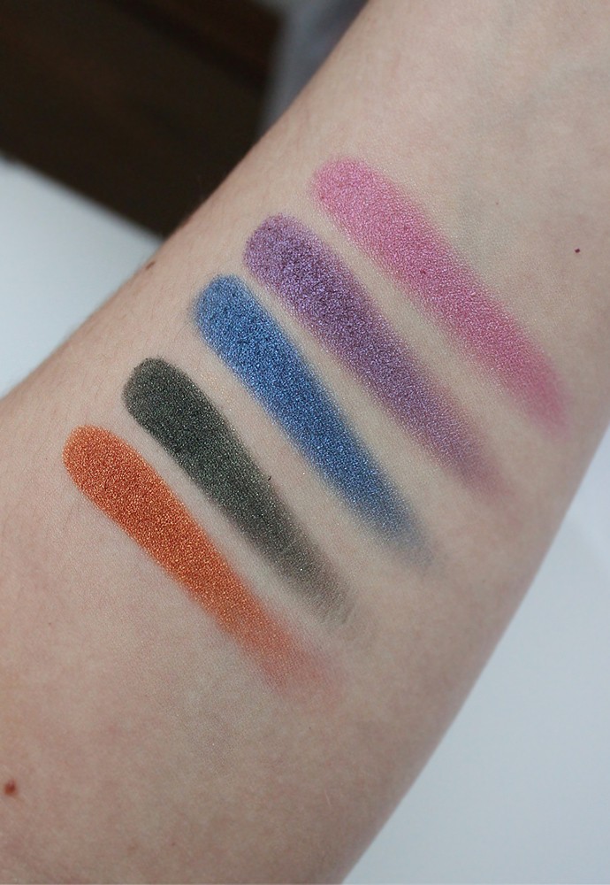
Urban Decay Distortion Palette Swatches (left to right): First Offense, Hot Box, 5.0, Rogue, Trash Talk
MIDDLE ROW:
- First Offense – burnt orange with copper metallic shimmer (warm). Amazing shade! Super rich, very opaque, very pigmented, blends like a dream with no fallout. Think glammed up pumpkin pie.
- Hot Box – blackened hunter green with subtle siver and green satin shimmers (neutral). Very rich and opaque, loses a lot of green pigment when blended out, and turns into gray/black. It is a lot less shimmery on the lids than it appears in the pan.
- 5.0 – azure blue with blue satin microshimmer (cool). This color was surprisingly dry and less pigmented than other metallics, but it seems to layer alright and blends well.
- Rogue – muted lilac purple with pink and purple satin microshimmer (cool). Not super pigmented, but can be built up to full opacity, and blends well without losing color intensity.
- Trash Talk – rosy mauve with pink and lilac satin microshimmer (neutral). Very buttery, superbly pigmented, blends like a dream – it’s second only to First Offense. This is a marvelous shade.
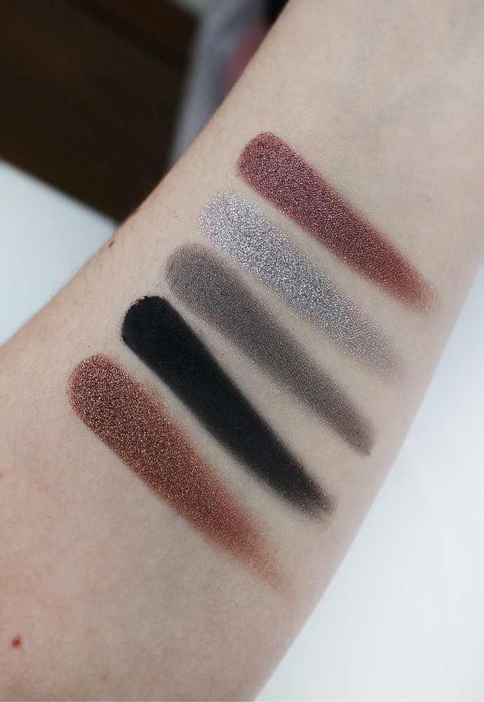
Urban Decay Distortion Palette Swatches (left to right):Territorial, Blackout, Old Smoke, Shag, Velvet
BOTTOM ROW:
- Territorial – medium brown with strong golden and bronze metallic shimmers (warm). The swatch says it all. It is an absolute beauty! Super buttery, very smooth, and does on in a super opaque layer in one swipe. It actually blends pretty well, too, but it does create a little bit of a fallout because of how much product is deposited at once. You might want to go light-handed with this one.
- Blackout – A LBD of UD palettes, this classic true black matte shade is one of the better formulas on the market. And like many mattes, it does have a little fallout, so watch out for that.
- Old Smoke – mushroom greige with very subtle silver and pink microshimmer (neutral). There’s something oddly attractive about this boring greige. It feels very silky in the pan, and needs to be built up for full opacity, but it blends really well and doesn’t create fallout.
- Shag – light gray with strong silver metallic microglitter (cool). Intensely pigmented, goes on like butter, and blends into beautiful scatters of silver microglitter, which does not feel chunky or scratchy on the lids. Also worth noting that this is the only glittery shade in the palette.
- Velvet – burgundy brown with strong bronze and silver metallic shimmer (neutral). Pretty much the same sentiment as with Territorial. The formula is a dream to work with, very soft, pigmented, and blends like a dream. But because it’s so easy to pick up a lot of product at once, it may create fallout.
Urban Decay Distortion Palette will launch in December and retail for $48.
BOTTOM LINE:
I hope you enjoyed my Urban Decay Distortion Palette review. I tried to pack it with as many first impressions as I could regarding each individual shade to give you guys a better idea on what to expect. While there are some neutral colors in Urban Decay’s Distortion, this is not a neutral palette. If anything, it’s definitely meant for creating bold looks, like a killer smokey eye or a shifty cut crease. Distortion is proof that you don’t need to use super bright, neon colors, and a lot of glitter to create a bold palette. I also love the color pairing suggestions. I don’t own every single UD palette so I don’t know if they’ve ever done this before, but I think this was a genius move. I try to donate or find new homes for makeup that I don’t use often, but I will definitely be keeping this one as my night out essential. I may not be bold enough for glitter and neons, but I am definitely bold enough for these.
If you are a VIB Rouge, you can already take a look at this palette online at Sephora ahead of the launch. For everybody else, Urban Decay Distortion Palette will be officially available in December.
What do you think about Urban Decay Distortion Palette? Will you be buying it when it launches? Let me know in the comments below!


Okay, so I need this. Love it!
It’s a great versatile palette, especially if you like a little bit of shimmer 🙂
Damn. Another palette hits my wishlist.
Haha, I know right? UD did it again!
Gee, how did I miss this one! I love the connecting lines that give you tips on color combinations – very cool
Indeed, those lines are so helpful!
This palette just got to my home! Can’t wait to play with it. thanks for the great swatches!
I hope you like it! Seems like Temptalia didn’t give it a good rating, but I will respectfully disagree with Christine on that one 🙂 I think it’s a great palette.
I can see it on Sephora’s site and I’m not Rouge! I love the combo of the shifty shades with other colors. Looks fun!
The shifty shades are a nice touch. They are what makes the palette so different from many others.
I’m like you – beige/neutrals are my color palette. I’m not sure I can pull off some of the bolder colors. 🙂
Beiges and browns are so good for everyday wear 🙂
I’ve heard so much about Heavy Metals that I wasn’t aware that this was coming out. Beautiful shades that I can see myself enjoying in spite of the brightness I don’t usually wear.
The bright colors add a nice hint of color, and I think they can look very subtle when worn alongside neutral shades. This is a great palette!
I skipped the Heavy Metals palette so I may snap this one up, thanks for the review!
I decided to skip Heavy Metals too, mainly because I don’t really wear metallic shades all too often anymore. I think I would personally get a lot more use out of this one.
I am tempted to pick this up although I know I won’t be able to use all shades, lol
I think you can use all of them, Kath! They pair really well with each other. Even the bolder shades that normally would be a bit too bright for me look very elegant when I wear them with the neutral ones.
LOVE THIS!!!!!!! Personally, I really love the last row but it’s nice to have colors you can use to give yourself a fresh look. Love this review!!!!
Looks like I’m going to have to add this one to my Christmas list!
The packaging is like ??♀️
Yes! Those are so good for everyday! And the bright row is perfect for going out 🙂
I feel like this one has so many combinations and option! Really pretty!
Indeed, the combinations are limitless 🙂 Well, according to math they are not, but who’s counting, haha?
The first row will not suit my skintone, but the next two rows are stunning! Blackout is one of the finest black eyeshadows I’ve seen!
The top row is the ‘shifters’, they transform other shades in the palette 🙂
Okay, I am loving that middle row!
Pretty, isn’t it? Those shades offer a nice pop of color.
Wonderful review and you’ve convinced me I need it. I already went to see if it was available before I got to the end of your post—that’s how much you convinced me!
Thank you! I’m glad you found my review helpful.
This is so fun! I don’t own a ton of eye shadows, so I think this may go on my Christmas list for bold looks!
If you don’t already own a lot of eyeshadows, this is a good start for sure. There are plenty of neutrals for everyday looks, and a few bold, but universally flattering brights for a pop of color when you feel like doing something different. Let me know what you think of it if you end up getting one!
I think is one of my favorite palettes so far!