
I bet you waited all month to see what nail polish colors SquareHue prepared for us in July, after all this month’s featured decade was one of the brightest and most memorable. So let’s sit back and enjoy our trip into the hues of the Swingin’ 60s!
 HOW IT WORKS: For $14.99/month + Shipping & Handling, SquareHue subscribers receive a limited edition collection of 3 carefully curated season-appropriate nail polish colors. Alternatively, the company recently launched a 2-polish box variation that costs $10.99/month + Shipping & Handling. Each month has a distinct personality to suit a variety of dress needs. Quick drying “5-Free” Clean formula does not contain Formaldehyde, Toluene, DBP, Camphor or Formaldehyde Resin. Click here to subscribe.
COUPON CODE: Use code BOGO to receive a surprise box with your August shipment. Valid for new subscribers only.
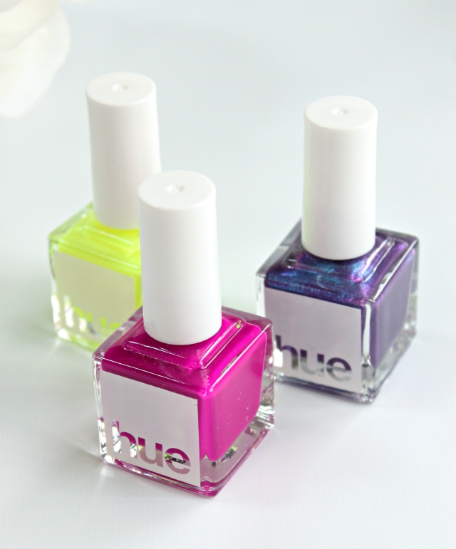
 This month’s collection consisted of two bright matte neon cremes [a type of polish we don’t get to see often, and I bet most people don’t have anything like this in their collection], and one dark metallic duochrome with high shine finish.
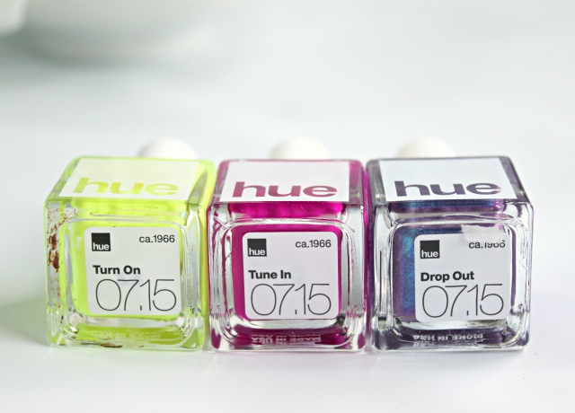
The first color I swatched was called Turn On 1966, an ultra-bright neon highlighter yellow. It’s so bright it could be a light source, haha! I think this is a tough color to pull off for me, especially for everyday wear, but I saw some clever nail art on Instagram that makes it look more tame. Also, there was some chocolate stuck at the bottom of my bottle, lol! I think one of the packers must’ve been hungry 🙂
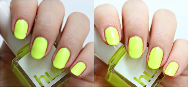 Since neon polishes are incredibly hard to photograph I took two takes with different settings. The brighter one is what it looks like in the sun, and the darker picture is closer to what it actually looks like in real life.
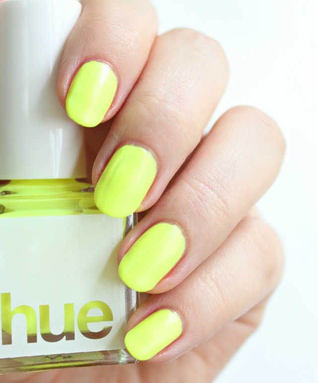 I’m not particularly great at applying mattes to begin with, so I found this formula challenging to work with. I thought it was too thick and didn’t go on smoothly, even after I tried to level it out with extra layers of polish. In the swatches above I’m wearing four coats, but you can still kind of see the streaks.
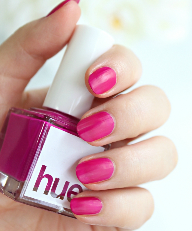 The next color I tried is called Tune In 1966. It looks like a bright medium neon fuchsia in the bottle, but on my nails it shows up more berry-pinkish, if that makes sense. This formula is more pigmented and thinner than the previous polish, making it much easier to apply.
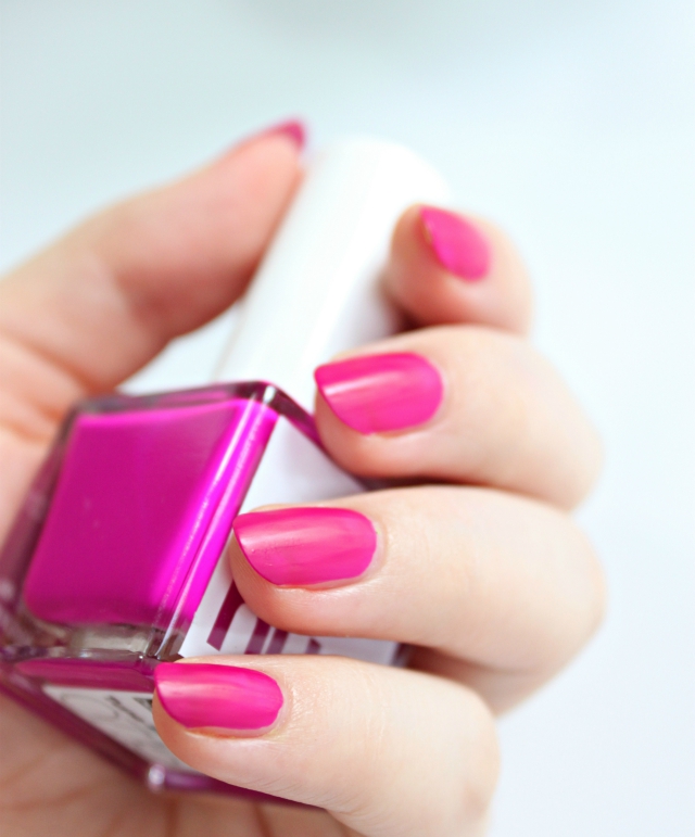 In these swatches I’m wearing two thin coats with no base or top coat. I actually like this color quite a bit, it looks very interesting on the nails. It’s not a true matte, because once it sets I can still see a little bit of sheen, but I actually like it that way. Now that I mention it, it reminds me of those “leather” finish polishes that were popular a couple years ago. Are they still around?
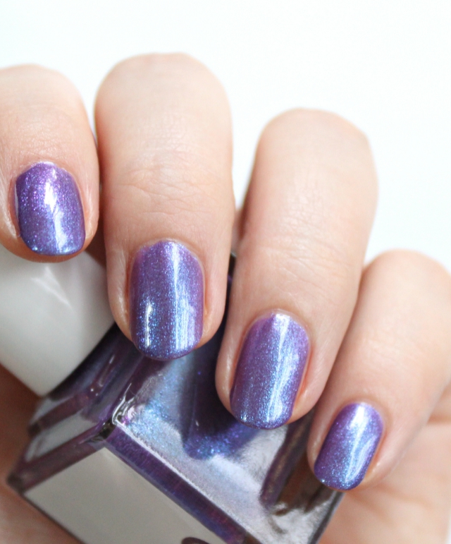 Finally, my favorite of the bunch – Drop Out 1966. The color is jaw-droppingly gorgeous, I just can’t get enough of it! It’s a warm medium purple base with sky blue, purple, and fuchsia crushed shimmers that make your nails look either purple or blue, depending on the angle. In the swatches I’m wearing three coats of polish, topped with a thin layer of Seche Vite top coat for some extra shine.
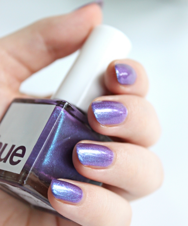 I just can’t stop staring at my nails! I feel like this color is something I’ve been missing in my stash; it’s like finally getting that perfect Tetris piece to take off a bunch of rows at once. Love love love this one!
THE VERDICT: Even though Turn On was a bit disappointing, this box still left a positive impression, because I’m head over heels in love with Drop Out! That color is sheer perfection, with a formula to match, and I’m sure I will wear it a TON in the upcoming months. Heck, this just might end up being one of those rare occasions when I completely use up a bottle of polish.
What color from the 60s do you think this collection was missing? Do you ever wear neon matte nail polishes? What is your favorite duochrome color to wear on your nails? Let me know in the comments below!
Disclosure: This post features products received for editorial consideration and may contain affiliate or referral links. For more details about my product review policy, copyright, and information about affiliate links, please refer to Disclosures & Content Use page.
I thought they would do hot pink and orange for the 1960s or lime green. I love the duo chrome. I would definitely let them know about the chocolate in one of the bottles. That’s unacceptable
I wasn’t sure what colors they’d pick for the 60s, but I also thought there would be a lime green or something. Highlighter yellow works too though.
The duochrome is lovely!
It’s gorgeous indeed, SquareHue did well creating that one.
That purple is AMAZING. I like the hot pink too
Right? I’m just swooning over it! It’s one of the prettiest purples I’ve seen so far, and I’m totally wearing it on my tips today.
You know that yellow needs to be mine!
Haha, that one is so tricky to pull off! I wish I was bolder to rock it just like that 🙂
I wasn’t expecting to like it so much, but I really like the yellow!
I’m glad you like it! It’s a fun color for summer, but I personally prefer it in nail art 🙂
I love that highlighter yellow shade!
It sure is different, isn’t it? 🙂
Such a fun trio!